

Brand Identity & Visual System
Regenrate is a regenerative agriculture company building fair, transparent value chains that allow farmers to earn real income from cover crops, without changing their main rotation. By connecting agronomy, science, and global markets, Regenrate turns idle land into profit while improving soil health and long-term resilience.
The challenge was clear: create a brand that speaks to farmers and industry partners with the same credibility, grounded in the field, confident in data, and free from greenwashing or empty sustainability rhetoric.
The Challange
Regenerative agriculture is often framed as activism or ideology. Regenrate needed to position itself differently: agronomy with a business plan.
The brand had to:
- Feel credible to farmers, not aspirational or corporate
- Translate complex systems (soil, supply chains, certification, markets) into something practical and understandable
- Stand out in a conservative agri-market without losing trust
- Scale across countries, crops, and stakeholders while staying consistent
The Approach
The identity was built from the soil up — literally and conceptually.
We developed a clear, modular brand system rooted in three principles:
- Field-first honesty: real people, real land, real outcomes
- Clarity over hype: simple language, sharp hierarchy, no buzzwords
- Confidence without noise: bold but grounded, modern but practical
Every visual and verbal decision was designed to help Regenrate communicate with precision, trust, and momentum.

The Brand System
- A custom wordmark and icon system inspired by growth cycles, seeds, oil, and measured value
- A distinctive light pink primary colour, intentionally unexpected in the agri-space, paired with deep soil tones and natural greens
- A flexible colour system that adapts from farmer-facing materials to investor and industry communications


Messaging & Voice
- Clear, conversational, and direct
- Confident without being loud
- Data-driven, but human
Messaging focuses on tangible value: hectares, contracts, yields, and income. Not abstract promises.

Typography
- Barlow Semi Condensed for confident, structured headlines
- Atipla ND for editorial clarity and personality
- Barlow for accessible, long-form readability
The result is a typographic system that feels modern and precise without losing warmth or legibility.

Photography & Art Direction
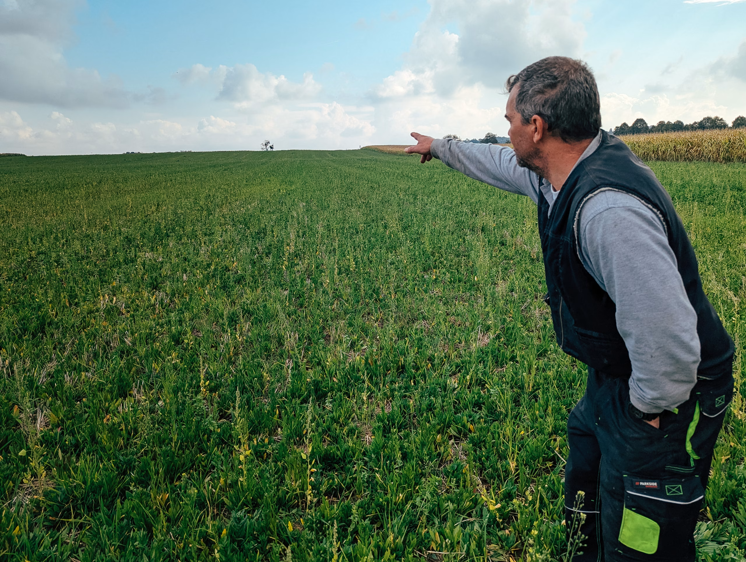
- Field-first, truth-first photography
- Real farmers, agronomists, and landscapes
- Natural light, real moments, and clear space for messaging

Outcomes
Regenrate now has a brand that matches how it operates: practical, ambitious, and trusted.
The identity supports growth across markets, strengthens credibility with farmers and partners, and clearly differentiates Regenrate in a crowded sustainability space by being sharper, clearer, and more grounded.


Thank you for coming over.
Please don't be shy and say hi :)
Passion Fruit Studio
Amsterdam, Netherlands
KVK: 96400080
VAT: NL005207945B35
2025 © All Rights Reserved - Privacy Policy